10 Simple Ways To Improve Website User Experience

Have you ever visited a badly-designed website where the fonts were too small, paragraphs too large, colors too garish or pages took forever to load? Perhaps your website has some of these issues too.
Today website usability and user experience are important ranking factors in Google, and it doesn’t just apply to mobile websites.
According to Moz, Google interprets better user experience as a signal of higher quality. Improving your website user experience also ensures that visitors perceive it positively, which boosts sharing, return visits and inbound links – all factors that contribute to higher rankings.
A stellar user experience can also improve website conversion and boost customer loyalty. In this article, I outline 10 ways to improve website user experience.
How To Improve Website User Experience
1. Increase Font Size
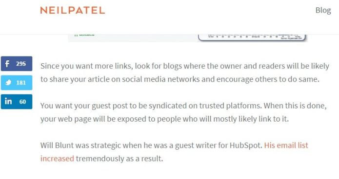
Ever visited a website where the font was too small to read? If you’re over 40 to 50 years old, this is probably a frequent occurrence. Unlike Neil Patel, whose blog provides an amazing user experience, thanks to the extensive testing he carries out, few bloggers really test to see what font sizes work for their readers.

If you want to get a little technical, you can even implement a few tricks that allow your visitors to change the font size with Javascript. But, as you can see in the image above, the font size on Neil’s blog is large enough for anyone to read, even seniors who need reading glasses.
This is a very thoughtful thing to do and all it requires is adjusting your CSS to allow visitors to read your blog easily. A little thoughtfulness goes a long way, and it pays off in spades for Neil, because his blog gets over 100,000 visitors a month.
2. Improve Web Page Loading Speed
No one likes to wait around for a slow-loading page. About 40% of your traffic will leave your site if it takes more than 3 seconds to load. Heavy or slow-loading pages can lead to a high-bounce rate and lower rankings.
How do you know if your visitors are finding your site slow to load? Check it out with tools like the Pingdom Website Speed Test or GTmetrix’s tools that will give you the full picture on how your site loads and help you detect where the bottlenecks are.
If your site could use a speed boost, check out this list of 7 of the most common mistakes that you may have committed. Some mistakes include:
- Using free themes
- Too many plugins
- Widget-heavy homepage
- Cheap hosting
Some ways to improve your page load times are by using optimized and professional themes, installing a caching plugin such as WP Super Cache or W3 Total Cache. You should also consider moving to a better hosting provider like BlueHost.
Another option you can implement to boost page load times is a content delivery network (CDN), which is a network of servers that are spread across the globe. Depending upon the location of the visitor, the CDN uses a server that is placed closest to the visitor to deliver content, reducing the lag due to the distance between a visitor and a server.
If you have slow loading speed, you can take help of skeleton screen to enhance user experience.
3. Use Lots of White Space
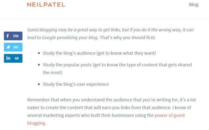
Ever come across a blogger who posts long paragraphs of unbroken text that are impossible to read online? This is a very thoughtless way to write copy.
The rule of thumb for in-page formatting is that paragraphs should be no longer than 2 to 3 sentences long. Also it’s a good idea to use sub-headings, bullet points and lists to break up text. Again, Neil Patel’s blog is a perfect example of this as seen below.
Using lots of white space in your copy and across your page greatly improves website user experience. Ensure that your writers, bloggers and designers all follow this rule when writing and publishing new pages or blog posts.
4. Optimize Your Color Scheme
If you want to improve the usability of your website, a rule of thumb is to avoid light text on dark backgrounds as this is hard to read. Dark text on light backgrounds is much easier to peruse.
Colors create branding, define mood and influence responses like purchase decisions. Before you design your website, take some time to understand what response you want to elicit from your visitors and then use the color scheme that is most likely to create the response you want.
When you understand color psychology, you can use that knowledge to boost your conversion rate, says Neil Patel in his article on The Psychology of Color. Again, because of his extensive testing, he is one of the best sources on this topic.
Men and women respond to colors differently. When using a Call To Action (CTA), you might do best to use colors that contrast with the rest of the design rather than blend in. But ultimately you should do your own testing to find out which color scheme works best for your audience.
5. Check Your Google Analytics
Checking your Google Analytics to find your exit pages can help you assess whether usability issues are increasing your bounce rate. It’s the low-hanging fruit that can help you improve your user experience.
If you find out that a lot of visitors are exiting your ecommerce store before making a purchase, for example, check your shopping cart experience to see if there are any elements that are causing them to leave.
It could be as simple as fixing a button that does not work properly or as complex as a complete page redesign. The important thing is that your Analytics can alert you to usability problems before they impact your sales and profitability.
6. Use Heatmaps by SumoMe
The SumoMe plugin comes with a free Heatmaps feature, that shows you exactly where people are clicking on your site, so you can improve your pages to show your visitors what they want to see. You can see which elements of your page they are more attracted to and move your call to action to make it more visible to your visitors.
Every heat map you set up is updated in real-time showing the latest clicks from your visitors. This feature comes in both a free and pro version. The Pro version is for people who want to record more than 1,000 clicks per campaign.
7. Create a Mobile Friendly Website
This is really a no-brainer. With Google’s mobile-friendly update, it has become essential for website and ecommerce site owners to provide users of mobile devices with a mobile-friendly version of their websites, either by using a responsive theme or a mobile-friendly WordPress plugin.
With over 50% of searches being conducted on mobile devices, creating a mobile-friendly website is no longer an option but a necessity and Google’s algorithm will give higher rankings to sites that are optimized for a mobile user’s experience.
Must read: How Google Accelerated Mobile Pages will help WordPress publishers and how to integrate it
8. Implement Calls to Action
Are your website visitors confused when they visit your website because they don’t know where to click next? If you want to make your website more user friendly, make it clear what action you want your visitors to take when they’re browsing it.
Do you want them to buy your products? Subscribe to your blog? Download your free giveaway? Then tell them clearly with a “Buy” button or a subscription form advertising your newsletter or giveaway.
Test the best place to place your CTA, whether in the header, sidebar, footer, or half-way down your page. Again, see how Neil Patel does it unambiguously on his Quicksprout blog below.
9. Create a Table of Contents
If you’ve written a long list post on your blog and want to make it easier for visitors to browse your post, and maybe click on only the items in the list that they want to read, you can create a Table of Contents using a plugin.
There are a number of plugins that can create a very attractive TOC, including Table of Contents Plus, CM Table Of Contents, which are both free, and Indexa which costs $17. The TOC above was created with the Table of Contents Plus plugin.
10. Translate Your Site Into Multiple Languages
Did you know that you could get more traffic if you translated your copy into Mandarin and Spanish, the two most popular languages in the world? Neil Patel did this on his QuickSprout blog, translating it into 82 languages, resulting in a 47% boost in search traffic.
Neil used the Transposh plugin to implement this, but you can use a number of multilingual WordPress plugins, like WPML and qTranslate, to make your website accessible to readers who don’t speak or read English.

I hope you’ve enjoyed these tips to improve user experience on your website. If you have any tips of your own to share, do post them in the comments below.


Leave a Reply