15 Ways To Create A Great Mobile User Experience For Your Blog Readers

For years, experts have been warning that mobile internet use will soon overtake fixed Internet access.
According to this article, we are now well past the tipping point, with mobile digital media time in the US being significantly higher at 51% compared to desktop (42%).
These statistics bear out on some of my more high-traffic blogs, where mobile users comprise almost 50% of all blog readers.

In 2015, Google’s Mobilegeddon update made mobile user experience important for search engine rankings. The question now is not whether, but how to improve the mobile user experience for visitors to your blog or website.
15 ways for an exceptional Mobile User Experience
1. Use a responsive or mobile friendly theme
Use a responsive WordPress theme to make your blog display well in all mobile devices and ensures that your images are responsive. Club WPeka offers a large number of responsive WordPress themes for every niche.
2. Use a plugin to create a mobile-version of your blog
If, for some reason, you can’t use a responsive theme, you can use a plugin like WPtouch Pro to create mobile-optimized version of your blog. The one beef I have with WPTouch is that the $49 version doesn’t create responsive images. This is only available in the $229 agency version.
The Social Media Examiner blog uses WP Touch Pro to create a great looking mobile version of its site.

3. Create responsive images
The srcset attribute allows developers to swap out large images for smaller ones more suitable to the size of the devices screen. This allows for less overhead when loading a website, improving load times, and reducing the amount of bandwidth visitors have to consume to view the site.
As I mentioned in my post here, there are a number of plugins that will create websites with responsive images. If your blog theme does not create responsive images, use one of these plugins to rectify that.
4. Use short headlines
Unnecessarily long headlines force readers to scroll to read them. Long headlines also get cut off in the search engine results and can decrease clickthroughs to your website.
Make it easy for someone skimming on a small screen to read your headlines by keeping them short. Keep your headlines below 60 to 75 characters and put the most important elements, such as keywords, at the beginning and end of your headline.
5. Use a legible font size
While smaller fonts may look pretty and be readable on a desktop, it’s best to use larger fonts on your blog so your readers are not forced to zoom in to read them.
According to this article on UserTesting.com,
“Older users or folks with visual impairments especially struggle with small text. Even people with perfect vision experience eye fatigue from staring at screens for too long – and get irritated when they have to squint or zoom in to read text.
For desktop, 50-75 characters per line at 16 pt font or higher is a good rule of thumb for body text. A good rule of thumb is to use 30-40 characters per line for mobile.”
6. Use contrasting colours
You can change your CSS so that your headlines, subheads and other elements use contrasting colours, especially on mobile devices. According to the same article on UserTesting.com,
“It’s especially important have enough contrast on mobile, where users might be outdoors or in bright spaces that cause screen glare. Pure black text (#000000) can be more difficult for dyslexic readers, and it can cause more eye fatigue over long periods of time.”
7. Use lots of white space
A general rule of writing online is to break up long blocks of text into small paragraphs of not more than 2 to 3 lines each. This is even more important for reading on mobile devices where long blocks of text can be unreadable.
8. Use subtitles and bullet points
Another way to break up content and make it more readable, both on desktop and mobile devices is to use subtitles and bullet-points in your blog post.
A lot of blog post readers are skimmers and skim through content before deciding whether to read it through. Well-written and catchy subtitles can entice them to read your content through, instead of just skimming it.
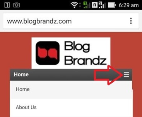
9. Use ‘hamburger’ menus
Long menus require scrolling and can disrupt your mobile reader’s experience. Consider creating shorter menus with just a few links that your mobile readers can navigate easily.
If you have a long menu, make sure your mobile theme or plugin creates an app-style menu (sometimes called a “hamburger” menu) so that your readers can expand the menu at a touch whenever they need it.
10. Replace text links with tappable buttons and menus
This tip is courtesy Greg Hickman in his post here. He notes that
“Websites that are not optimized for mobile users can give visitors a bad case of “Fat Finger Syndrome.” Fat Finger Syndrome occurs when a website’s links and buttons are too small for visitors to easily and accurately tap with their finger (or thumb).”
Replacing text links in your menu and Call To Action (CTA) can help your blog readers navigate your mobile website better and could increase response to CTAs.
11. Create exclusive mobile content
This tip comes from Alex Pinto at Yotta.com. He recommends that you “Consider creating mobile-specific content and posting to mobile-only social networks.”
You should also consider ways to drive blog traffic from mobile-only networks like Instagram. As the article here recommends, one way is to insert your blog URL in your Instagram bio and videos.
12. Use responsive sharing plugins
Make sure your sharing plugin offers a responsive experience on mobile devices. SumoMe is a plugin that looks great and works beautifully on both desktop and mobile devices.

13. Eliminate unnecessary elements
If you don’t need that Facebook Like box in your mobile website, eliminate it. Use simple follow buttons instead of large, clunky elements that force mobile users to scroll down even more.
14. Use responsive forms
Make sure your subscription forms are responsive and look great on mobile devices. Email marketing providers like Aweber and MailChimp offer many options for great-looking subscription forms.
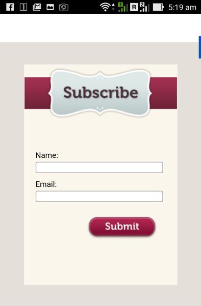
If you want to create attractive and responsive pop-over subscription forms you can use a plugin like SumoMe. If you need to create a responsive contact form, check out this review of 11 contact form plugins.
15. Make your email updates mobile-friendly
According to data from the US Consumer Device Preference Report: Q4 2013, 65% of emails get opened first on a mobile device. It is now imperative that you create a mobile friendly version of your blog’s email updates.
I remember Neil Patel mentioning, in one of his updates, that using HTML in email newsletters reduces deliverability. He was probably quoting this post in Hubspot, that people say they prefer HTML emails, but actually prefer text. Hubspot figured it was probably because plain text emails have better deliverability (hence, higher open rates).
This is one of the reasons why smart marketers, like Neil Patel have switched to a light-HTML format for their blog updates.

So if you’ve been filling up your blog broadcast template, with a lot of HTML and images, it’s time to take a step back and go minimalist instead. It’s likely to boost your deliverability and open rates.
I hope you’ve found these mobile user experience guidelines useful. Implement them and your blog readers will thank you for it. If you have any more tips to add, please do so in the comments below.
Additional Reading: Using skeleton screen to enhance user experience

Leave a Reply