Colors in UI design : Tips & Tricks to Use Color Wisely

Color and design are undoubtedly one of the most beautiful things that stir various emotions in humans. Right from watching things differently to rationalizing them in a completely dissimilar manner, there are numerous things a human can do just with color and design. A perfect balance is appealing to the eyes and senses, and can even influence thoughts and decisions. If you are heads and heels into UI designs, you surely would have come across a myriad of articles and books talking about the theory of UI design colors and palettes.
In design, although there are several factors that have a significant influence on the outcome, colors play a major function to attract users. Using vivacious ones is the easiest way to help customers relate to the brand instantly.
What is User Experience Design?
User experience design is nothing but the art of enhancing the overall experience of the user. A lot of factors influence it, but colors are definitely something which comes on the top of the list. The essential expertise of UI color scheme is competently modifying one base color into several variations. In short, how you tweak the color matters the most and not the way you are choosing them from the color theory or palette.
There are a majority of people who immediately click the save button the moment they come across an interface that is clean, nice, and elegant. Upon looking countless of designs closely, the common thing that you might stumble upon is the appealing factor of colors used.
Since it might be a bit problematic to discover a perfect way of using colors in a UI design, you’ll find everything useful here that will surely take you out of the dilemma. Let’s have a read.
The Magic Power of Colors:

As powerful as a language, colors can proficiently speak a thousand words. And, there is probably no significant argument about it. Think about it, whenever you come across a website or a product, the first thing that would be enticing you is the visual appearance, isn’t it? And the entire appearance is mainly based on colors, creating the first impression to be the best.
So, how can you spread magic with UI design colors? Here are some of the primary ways:
Reflection on Brand Personality:
A gamut of colors can be used to set the basic mood, tone, conception, and implication of a brand. According to a well-studied research, it only takes 90 seconds for a user to assess a product on the internet. And, between 62% and 90% of the scrutiny, final verdict is generally based on the color scheme of the brand.
Great User Experience:
Correct selection of colors can enhance the information readability to a great extent. Moreover, it can even increase the usability, including strong call-to-action, improved navigation, inspired instinctive interactions, fulfilled visual and aesthetic requirements, and much more. All in all, to create a precise and pleasant-sounding style to meet users’ needs, you should be emphasizing more on the color scheme.
Impact on the Purchase Decision:
According to a recent report, a product’s visual appearance has a key role to play in the purchase decision made by a consumer. Also, another research state that more than a majority of product assessments are strictly based on colors. This is the reason why companies are taking up best colors for UI designs as one of the integral parts of their marketing techniques.
Fundamental Color Concepts:
Not just do they vary in style and appearance, but each color comes with a different meaning. Hence, they can have a great implication on human life in the near future. Below mentioned is the meaning of different colors and their hidden qualities that you may go through for a profound understanding. Based on this, create your own UI color schemes as per your brand and products & services.

Tips & Tricks to Use Color Wisely:
In design, colors are everything but you must have a restraint while utilizing them. Just by sticking up to a maximum of three main colors in the color scheme, you can attain better and higher results. In a way, use of colors in UI design is strictly based on balance. The more colors you apply, the more complicated the design will become.
“Learn the rules like a pro, so you can break the rules like an artist.” – Pablo Picasso
Furthermore, if you are looking for extra colors other than what you’ve outlined in the palette, you can use tints and shades. They will surely offer a distinct tone to your work. Apart from that, have a look at these tips and tricks to use color wisely.
The Rule of 60-30-10:
It is nothing but quite impossible to just walk away from color combinations when you are completely engrossed in UI designs. Although you may find combining colors and easy job, do you know a simple way out to handle the mess and chaos that follow?
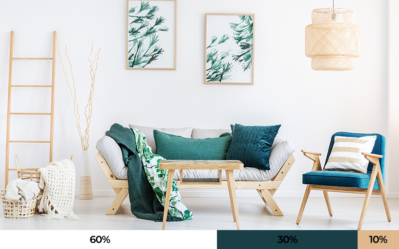
This extraordinary rule is one timeless technique that would help you create a color scheme seamlessly. You can provide utmost balance to UI design colors by applying the proportion of 60% + 30% + 10%. The primary reason behind the famed element of this rule is because it allows observers to move their eyes from one focal point to another comfortably. It is even simple to apply.
60% should be your dominant hue, keep the secondary color to 30% and give 10% to the accent color.
Choosing the Right Color For the Right Pattern:
Colors don’t look terrible, it’s your way of showing them that makes the entire design awful. No matter what, it is impossible to imagine KFC without its red element. Not just that, but if the brand changes its color scheme, most of the people may even lose their appetite for KFC’s eatable items, correct?
Since different colors convey varied senses and meanings, you should be using them wisely enough to attain the 5 rights, such as: selecting the right colors, in a right pattern of usage, at the right time, with the right target objectives and the right users.
Keep Purity of Gray & Black Aside:
One of the considerable UI design color tricks that you must keep in mind is to neglect the usage of gray colors devoid of saturation. In reality, pure gray or black colors don’t exist. Hence, you must always keep in mind that adding a tinge of saturation to these two colors is the key to perfection. Also, by doing this, you will help users to relate more to these colors subconsciously.
Blue is the King:
If you’d looked closely ever, you must have noticed one common factor among different popular apps or websites. Be it Facebook, Microsoft, Twitter, Safari, and more, you will discover that they are using different shades of blue, isn’t it?
This is because, according to a research, blue is considered a primary color by both the genders of a human. You can easily find this color everywhere around you. Hence, it is surely one safe color that may nurture trust among users. Furthermore, it is even a typical choice of UI designers. If you think you can’t find a better option, go with blue.
Look Around for Inspiration:
One of the main resources of color encouragement would be art and nature. When you lack motivation and try to give up, stop right there and look around. Some of the best inspiring color combinations can be seen in the environment. Look around at nature and you will spot the best colors for UI designs. You can even just step out of the house, ogle at the sky, and find different shades of one color. No wonder nature has the best user experience design.
Background & Element Color Variation:
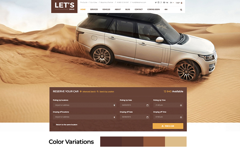
Have a look at this below-mentioned interface:

Although the interface comprises brown color, you must be focusing here on the variation part. Brown is the theme color, however, color for the rest of the elements are either darker or brighter. All in all, they appear out to be synchronized, harmonious, and balanced with each other, right?
Now you must be wondering how to attain this variation? In such a scenario, all you have to do is follow one golden rule and that is to lower down the brightness & increase saturation to achieve darker variation and vice versa for getting your hands on brighter variation. Easy enough? And when in doubt you can refer some online tools that can help you take a better call on the colour variations.
Black & White Are Elegant:
While white is widely used as a background color, black has been the strongest among other neutral colors. These two together can help you reach a superior color contrast level. By adopting these two colors appropriately, you can create an elegant UI interface and a great user experience design.
This is one color scheme that is generally used in different types of websites. Whereas black can provide an erudite feeling, on the same hand, a white space can efficiently create a logic of fancy and liberty.
Conclusion For Importance of Color in UI design:
Surely, color and design are two of the complicated idea to ace in, especially in the world of digital. Using different colors in UI design can help you create an elegant and mesmerizing interface, resulting in an amazing user experience design. Here is an article on the top 5 graphic designing skills every digital marketer should know.
However, that shouldn’t be your final destination. However, on the other hand, attaining the maximum user experience should be your ultimate goal. Therefore, these aforementioned tips will definitely help you simplify the process of figuring out the best colors. At the end of the day, the best way to master the art of color schemes is by practicing it yourself. So, do a favor on yourself and try to play with different colors.


The color choices on the website are usually the first impression we have of the site. Colors can speak the language. So this article beautifully puts what we need to know before designing a website. It should reflect the brand personality and help achieve a better user experience.