Design is Your Content’s Frame

You may have great content and awesome WordPress products or services, but if you don’t have a good way of showcasing, the greatness will remain in shadow.
The content you produce (text, images, colors, icons, audio or video) carries the messages you want to share. And your website design is a big part of communicating them. Certain niches have certain way of transferring knowledge, so web design is not a “one-style-fits-all” thing. The design of your online presence helps your visitors understand your business as a whole and if you want visitors to become your clients, it should make them feel at home.
Often, WordPress designers try to create a website that will make visitors do what the owner wants. I believe the goal is to create design that takes into account users’ needs and only once they feel satisfied with what you’re offering and how you’re offering it, will they want to become more than just some insignificant analytics metric.
For every different thing you try to achieve, you should try to find a different, niche-specific WPEka theme or a plugin.
You may have the best ideals, philosophy and intentions, but if you don’t present it the best way, it may all be for nothing.
Many marketers think that good design is making people do something that brings them instant revenue (convert), despite the fact that it may be something they may regret later. Se before thinking about the frame you’re going to create for your picture, make sure the picture is worth something and focus on it instead.
Good web design focuses your visitors on something that they may thank you later. A well-designed website doesn’t encourage clicking on countless menu items and offers or hunting that slider image that just went by. It’s about making sure your message resonates.
When it comes to efficient design, you’re going to focus on things that make your articles easy to consume, your portfolios easy to understand, your case studies easy to comprehend and make your landing pages and online shops usable and optimized for conversion.
Content
We’ve all heard that Google values the amount and comprehensiveness of online content. That being said, if you’re blindly following what the latest search engine trend is, you’re going to have a hard time keeping up. Focus on one thing per page and design everything around it. If it can be explained with one image and a caption, then do it that way.
Fonts
Fonts are the most important part of your website design. They’re directly responsible for conveying your thoughts. Often times website owners A/B test different layouts or colors, but forget about fonts.
If you’re one of those people, I suggest you read this interesting post on whether fonts can sway us to believe a statement is more or less true.
To test different fonts and their effect on conversions you can use many of the free WordPress plugins, but use them at least 2 weeks before you draw any conclusions.
Form
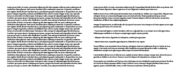
Headers, sub-headers and paragraphs are essential way of navigating through articles. They structure your content and make it easier for people to read and remember things.

Another important benefit is white space. Every new paragraph and header create empty (white) space, which signals that a thought is coming to an end. Texts with paragraphs are more inviting and take less effort to read making your words more effective and valuable.
Focus and clarity
Good communication is not possible without clarity. When visitors come to your website, within 5 seconds they should know what the website is about. And by the time they leave your website, they should’ve remembered at least one of your messages or unique selling propositions.
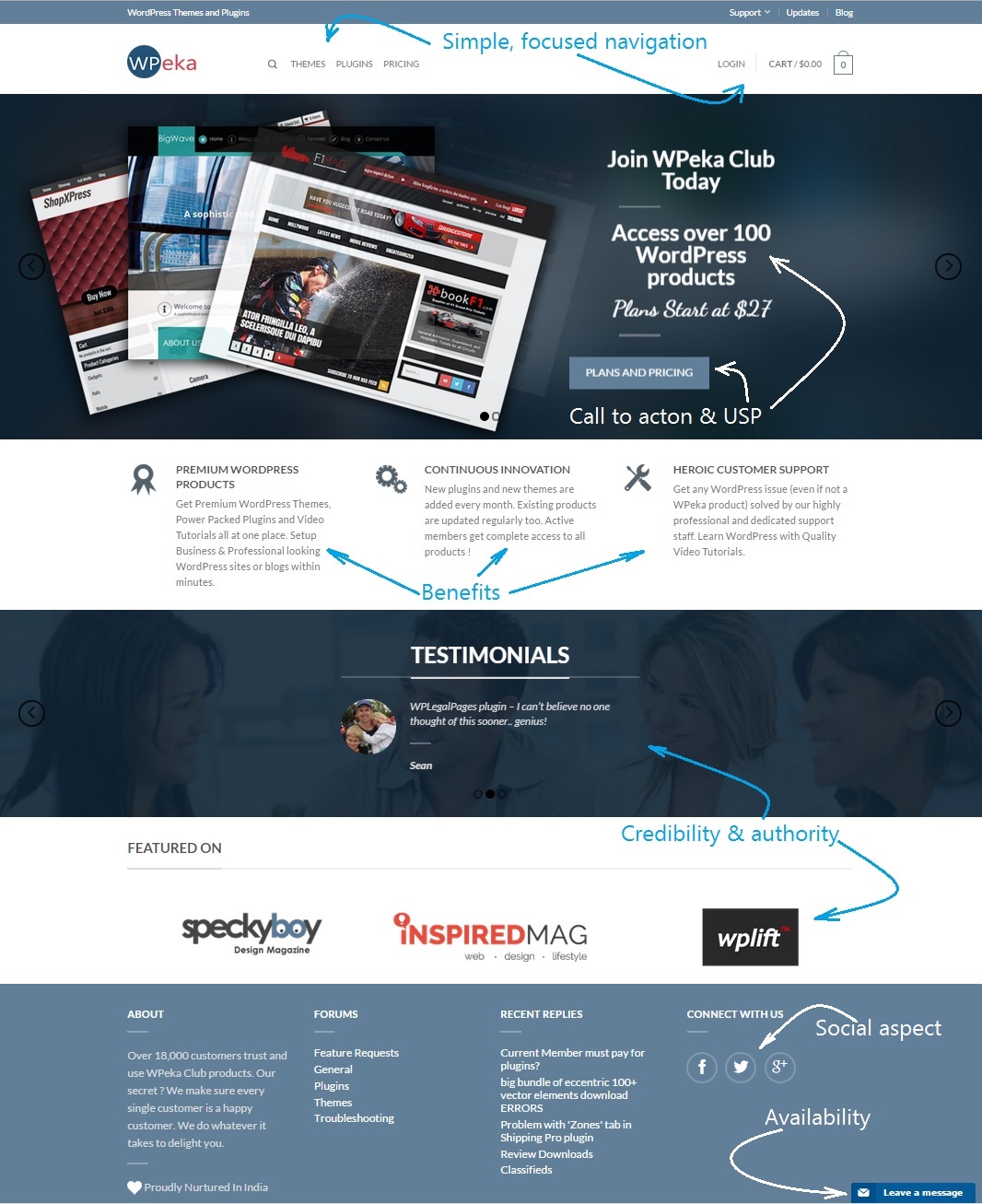
Let’s take WPEka website, for example.

This is a great example of how great design enables visitors to quickly recognize what the website is about and what it offers. Remember that every page of your website is a landing page through which your audience learns about you or your business.
The design of your website is your content’s frame and should complement it, not get in the way. So, before you decide you want a flashy, slider-filled, wow-effect website that just looks good, I suggest you try a more focused, clean design that amplifies your message with good usability, accessibility, speed and, of course, focus on content.
The result
If your website communicates efficiently with your users, with no friction points or rough edges, then your users will have more pleasant browsing experience. The result? More people coming back, lower bounce rate, more traffic, leads and sales.
What do you think about web design — should it be flashy and gimmicky or minimalist and functional?


Leave a Reply