Understand & Benefit From The Hero Image Trend in Web Design

A Hero, as defined by the Oxford Dictionary is
a person, typically a man, who is admired for their courage, outstanding achievements, or noble qualities
A hero is a champion, someone we look up to, and a born (or made) leader. We look up to heroes for support, inspiration, knowledge, and ability to convince the masses. But we aren’t talking about caped heroes we know from the movies; this isn’t about Iron Man, Bat Man, and Spider-Man.
Regarding Web design, a hero isn’t a hero really. Then what is a hero image in web design? It’s more like what happens in the upper part of the homepage, just before a user begins to scroll. It’s that section – which is all too popular now and terribly important for a website – which matters most for web design to actually start delivering any value to the premium it demands.
The Hero Section, as it’s called, is used for grabbing attention, telling stories, making a point, or to drive some action that’s elicited from visitors. It’s when that action happens (also called as conversions) that some sort of payback is noted for every website. Although we see a lot of these “hero sections” today (and for a good reason), the idea isn’t a new one.
What is a hero image in web design?
According to Gabrielle Gosha of Site Point,
The “Hero Section” – also commonly referred to as the “Hero Header” and “Hero Image” – is a design trend that isn’t all that new. Soap companies of the 1800’s competed vigorously to develop the most effect hero panels in their labels and newspaper adverts, featuring lithographs of cute kids, caring mothers, and fluffy kittens.
The hero section consists of a background (or not), an image (or not), a headline, a subheading, some accompanying copy or text and a button or two.
Sliders Kill The Importance of Web Design for Business
Hero section is also used to host sliders sometimes. Sliders are popular, and web designers just can’t seem to have enough of those sliders running on every website they create. However, sliders themselves are bad for website conversions.
From a purely non-design point of view (for a visitor), sliders tend to diffuse the focus that a site needs to have. By the time a site visitor tends to see an average of 4-5 sliders on every home page, the focus is lost.
Sliders are a poor way to present home page content, and it almost always kills conversions. For an area that’s premium real estate on a home page and for that size, an average of 1% clicks (and not conversions) is disastrous from a marketing standpoint, according to Peep Laja at ConversionXL.com.
Peep Laja also explains why carousels, rotating banners, and sliders just don’t work well for conversions:
- Sliders move. Humans react to movement (and that takes the focus away from what’s important)
- There are just too many messages, images, and graphical elements in addition to copy and text jostling for attention. In the end, no one pays attention.
- Banner blindness is a reality. Slider blindness is just around the corner.
The trouble is that web designers aren’t marketers. While it’s a popular trend to use sliders on the hero section, it’s a trend that perpetuated because web designers thought that this practice was cool. It leads to no conversions that’s not a problem web designers share with business owners and/or marketers.
Non-moving, Story-telling Hero Section
Unlike sliders, a functional and effective hero section makes use of non-moving elements on the very top of the homepage, just below the navigation menu. It drives home a central point. It works to send out a single message. It tries to showcase the best.
When you design a hero section like that, the focus remains on what needs to be focused. Hero sections do not have to be complex – but they have an important role to play, and its job is cut out from the start.
The hero section has to be non-moving, story-telling, purposeful, simple, and attention-grabbing. You could add more sections below the hero section to provide more context, add information, and convince or educate. No matter how you cut it, it’s the hero section that does all the heavy lifting.
Hero Sections To Drive Conversions
Since the hero section is indeed prime real estate, most businesses use the hero section to get the most important action off every visitor who visits a website. This web design trend has been made popular by the growing list of startups all over the world and is an increasingly ubiquitous trend – but it’s all for good.
Most SaaS companies, web apps, mobile apps, and startups have a much cleaner web design layout with the hero section almost built like a landing page (except that it’s still the home page). Landing pages are characterized by simplicity and function with a single call to action button – and conversion-focused hero page sections mimic that functionality.
On hero sections that are built to drive conversions, you often get this:
- A background (plain, image, or video)
- A massive headline
- Supporting text
- Sign up forms or buttons, or both.
Nothing more; nothing else. You’ll see variants in how each of those elements plays out on hero sections for modern websites, but the point is simple: get visitors to take actions that are critical for businesses.
Consider the following websites:
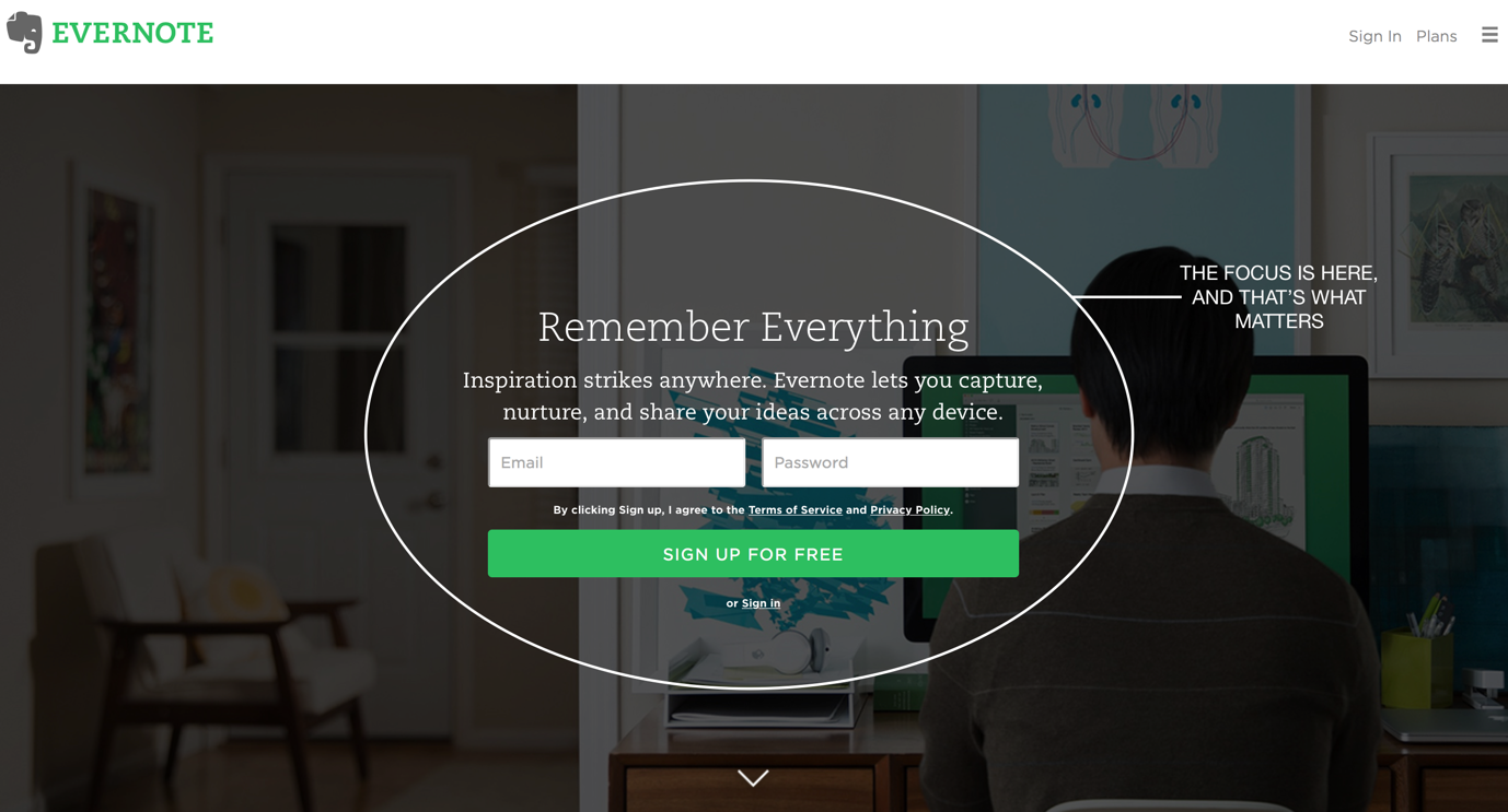
Evernote makes it all too easy for you to focus on just one thing on their Hero Section:
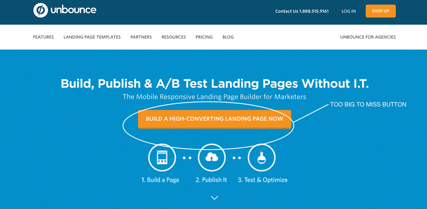
Unbounce not only has a “too big to miss” CTA (Call to Action) but also leaves visitors with enough social proof and other elements that gently guide visitors to sign up.
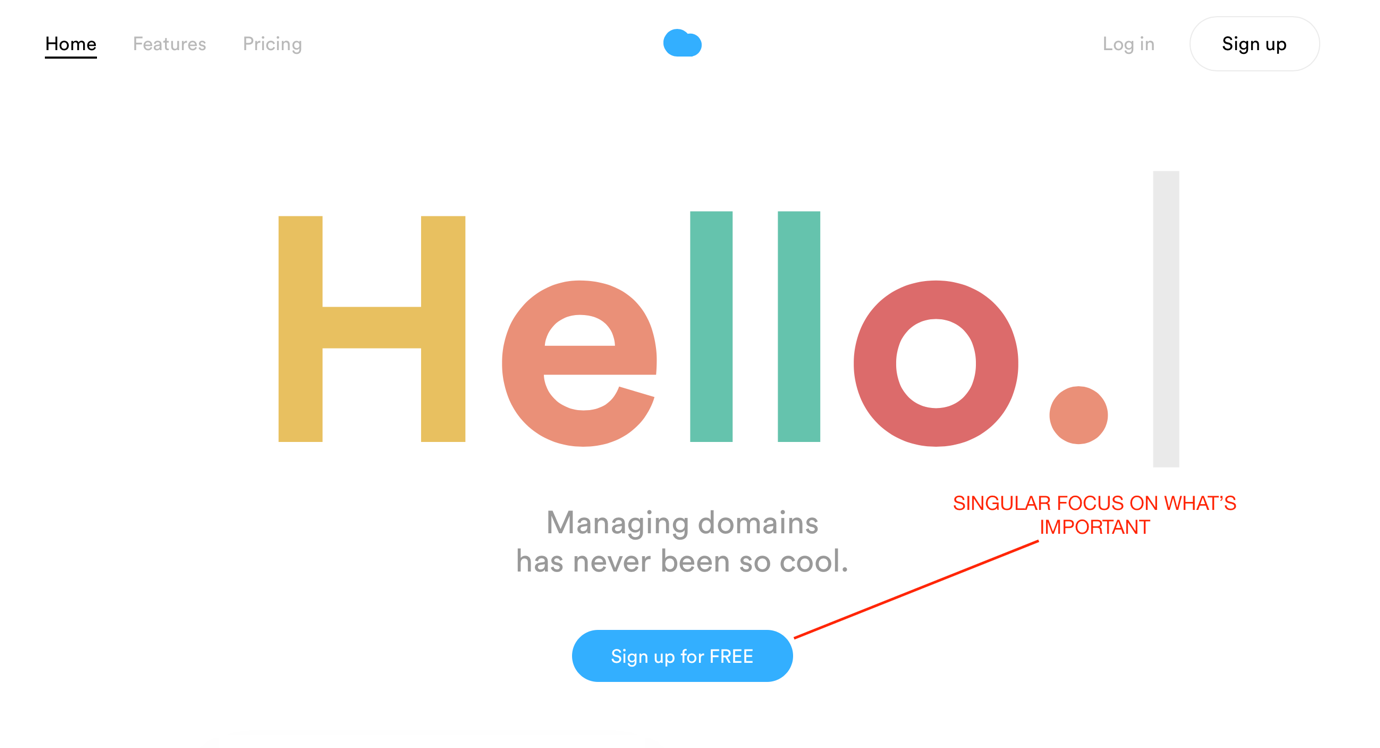
Nuage App tends to bring all your attention to a simple, appealing, and a no-hassle experience of signing up for a free account.
Hero Sections Won’t Go Out of Fashion
When something is effective, clean, sublime, simple, and extremely effective in getting “results”, it’s hard to let it go out of fashion – simply because it’s not “fashionable” anymore; it’s profitable.
Hero sections are built with modern web design trends and tricks such as letterboxing, grid-based design, responsiveness and adaptability to mobile devices.
The oversized display of the usual hero section is a great way to tell a story, to convince, to convert, to sell, to showcase, or even to just grab attention.
Here’s A List of Some Awesome Hero Image Scene Generators
Mockup and Hero Image Scene Generator – The Complete Package

- 440 smart objects
- 170 mockups
- 55 screen devices
- 22 premade scenes
- Photoshop CS6+
- Big resolution images
- 7 GB split in 12 .zip files
The Burger Bar – Scene Generator
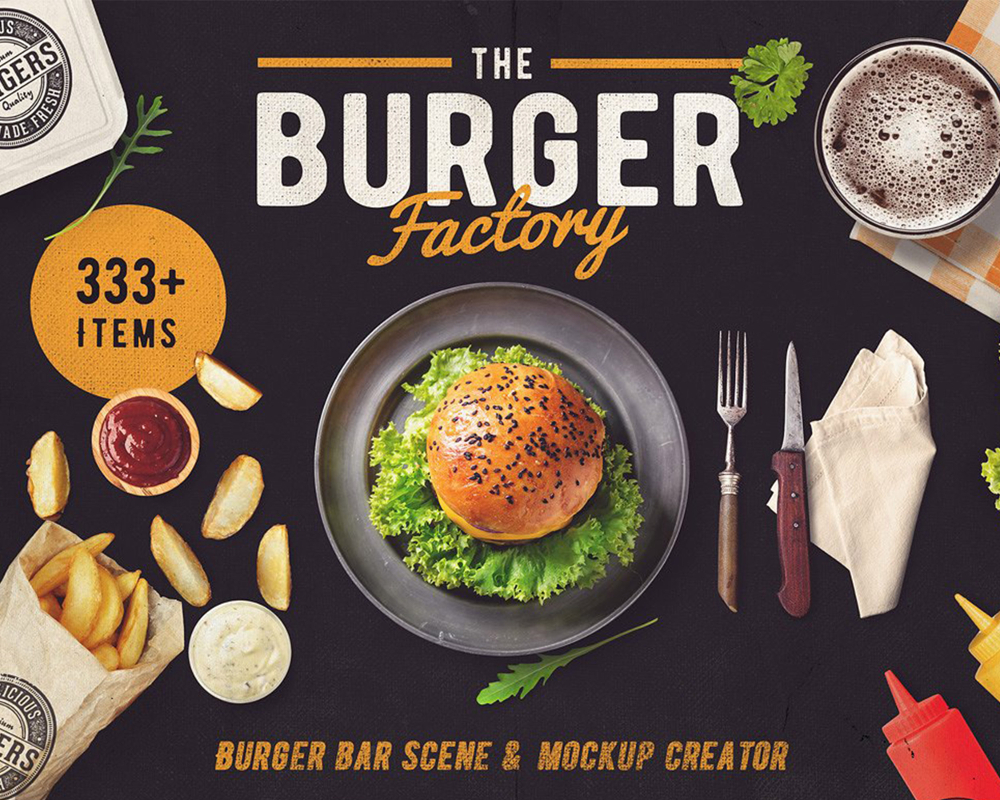
- Hero images scene generator
- Pre-made Instagram banners
- Isolated objects, mock-up creator, full editing as you want
- 333+ isolated objects
- 15 premade scenes
- 10 changeable background texture
- Bunch of branding mockups with smart objects
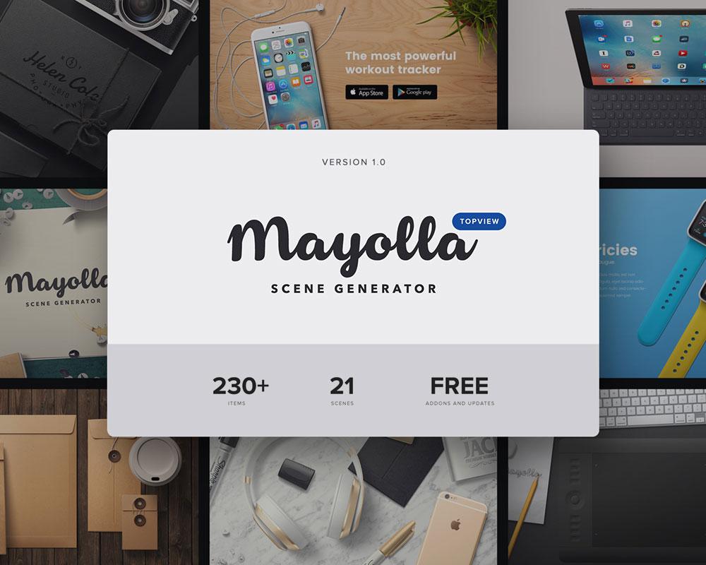
- 234 Unique Items
- 21 Pre-Made Scenes
- For Photoshop
- Free add-ons and updates
Stationery, Cosmetics and Wedding Mockup Scene Generator
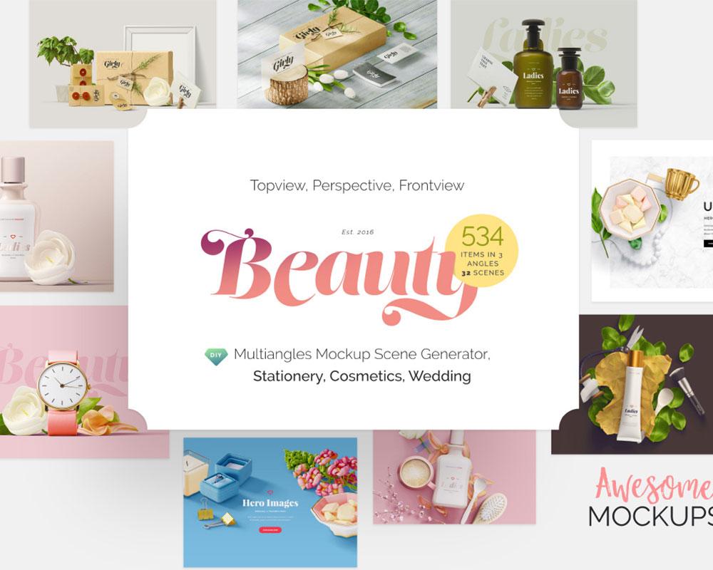
- 534 ITEMS, 3 ANGLES, 32 SCENES
- For Stationery/Office, Beauty Products, Marriage/Wedding Scenes
- Isolated elements, Color Masks, Mega Resolution, Separate Shadows
- Realistic Mockups
- Lots of adjustment layers
- Various Backgrounds
- Easy-to-use
I Am Creator – Scene Generator For Designers
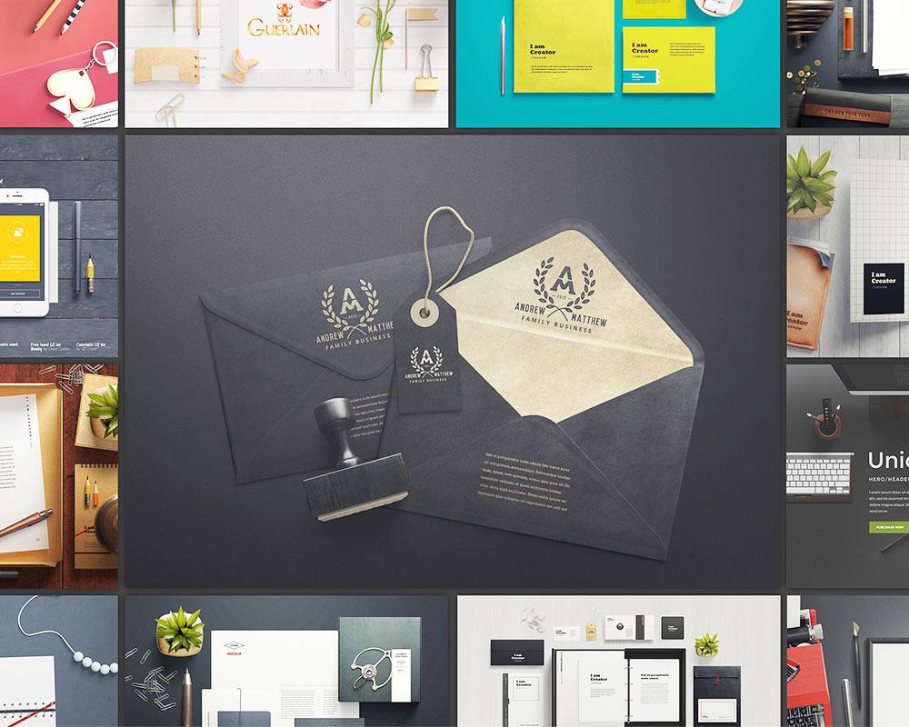
- 363 items (23 PSDs)
- 46 Sample Scenes (46 PSDs)
- Scene Generator (1 PSD)
- 15 backgrounds
- 16 premade adjustment layers
- Help File (1 PDF)
- Realistic Mockups
- Extremely High Resolution
- Layered Transparent Shadows
- Color Masks for Every Material
- Big resolution images
- Photoshop CS6+
- 13 GB split in 17 .rar files
- Free Updates Forever
- Pixel Perfect Designs
As Carrie Cousins of UXPin writes:
“As long as your images are high quality, interesting to look at and work well with your content, a hero-style homepage design is a great option.
Design with contrast and clear call-to-action goals in mind to help make the most of this bigger than life technique.”
Give Purpose to Web Design
Sergio Nouvel of UXMag opines that:
“High quality web design templates, mature design patterns, automation, artificial intelligence, and mobile technology are all signalling the end of web design as we know it”
He isn’t too far off the mark. For web designers, it’s more important to think of web design not as a service by itself but as a starting point to what really matters for businesses that invest in website design: profitability and return on investment.
That explains why hero sections need to have a purpose, and that you’d need to add more to your bouquet of services such as marketing, local or International SEO, content marketing, social media, and email.
By coupling web design with those related services, you are no longer a web designer. You are a complete marketing consultant promising to do a lot more than what a few pages of HTML5 and CSS3 can ever do.
How do you build your hero sections? What value do you provide along with your web design services?


“Hero Sections Won’t Go Out of Fashion”
I hope they do.
Huge screen-filling pictures shout “WORK” at the Visitor.
i.e. “I’m being forced to scroll to learn more than one thing about the website.”
“It works to send out a single message. ”
And this is the problem.
One IN YOUR FACE picture and little else has no context.
ALL messages have a context – and interpretation depends on the Visitor’s experiences not the web-designer’s.
A Home page with a Contents list – some bullet points – CLEAR navigation Menu – and maybe, just maybe a few thumbnails (that the VISITOR can CHOOSE to enlarge) tell a far more compelling “story” than one HUGE picture.